![]()


![]()
The 2020 Amazon Wildfires Story Map breaks down the causes and impacts of raging wildfires in the world’s cradle of life. Data comes from NOAA/NASA VIIRS instruments, ESRI, Garmin, the World Database on Protected Areas (WDPA), United Nations Environment Programme, the International Union for Conservation of Nature, and the Food and Agriculture Organization (FAO). Use the sliding graphic and mapping tools to view the environmental change.
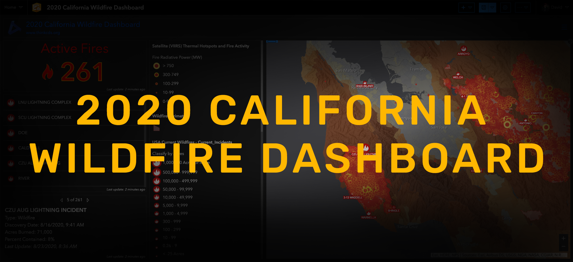
The 2020 California Wildfire Dashboard is a real-time interactive mapping system that shows current extent of fire, evacuation zones, and lightning locations for the CZU, LNU & SCU Lightning Complex Wildfires. Data comes from CalFire, local municipalities, the U.S. Forest Service, NOAA, and NASA. You can search for your address and customize the layers of data shown on the top right hand corner. See the “how to use” section underneath the main Real-Time Fire Hazard map for further details.
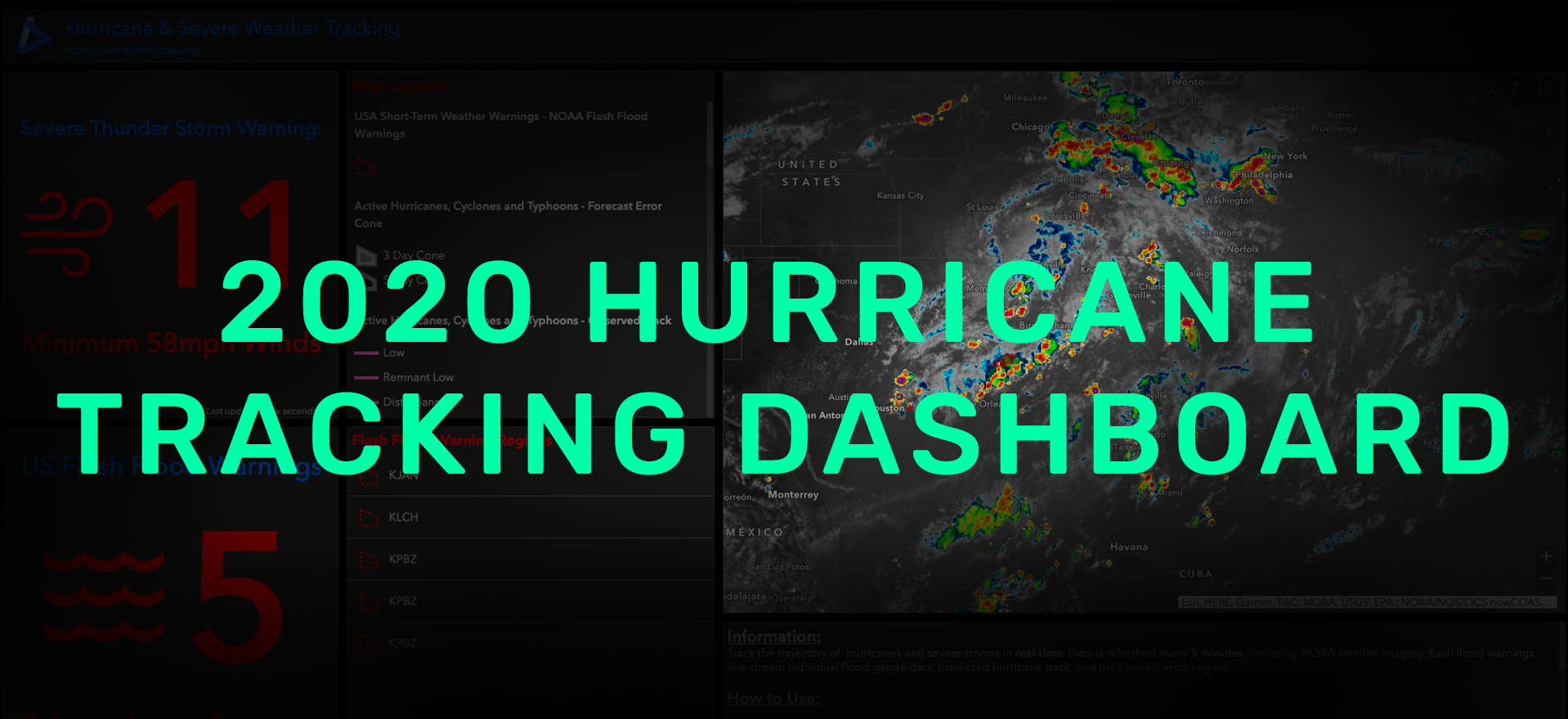
The 2020 Hurricane Tracking Dashboard is a real-time interactive mapping system that shows current track of hurricanes coming through the southeastern United States and Caribbean. All data comes from the National Oceanic and Atmospheric Administration. You can search for your address and customize the layers of data shown on the top right hand corner. See the “how to use” section underneath the main map for further details.
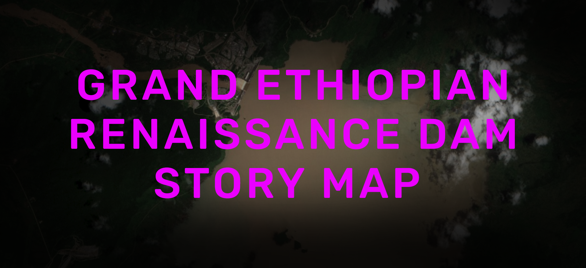
The Grand Ethiopian Renaissance Dam Story Map provides a brief overview of the spat two African nations have over shared water resources. Satellite imagery comes from the European Space Agency’s Sentinel-2 satellite. Use the sliding graphic to view the environmental change following Ethiopia’s decision to fill the dam in July 2020.